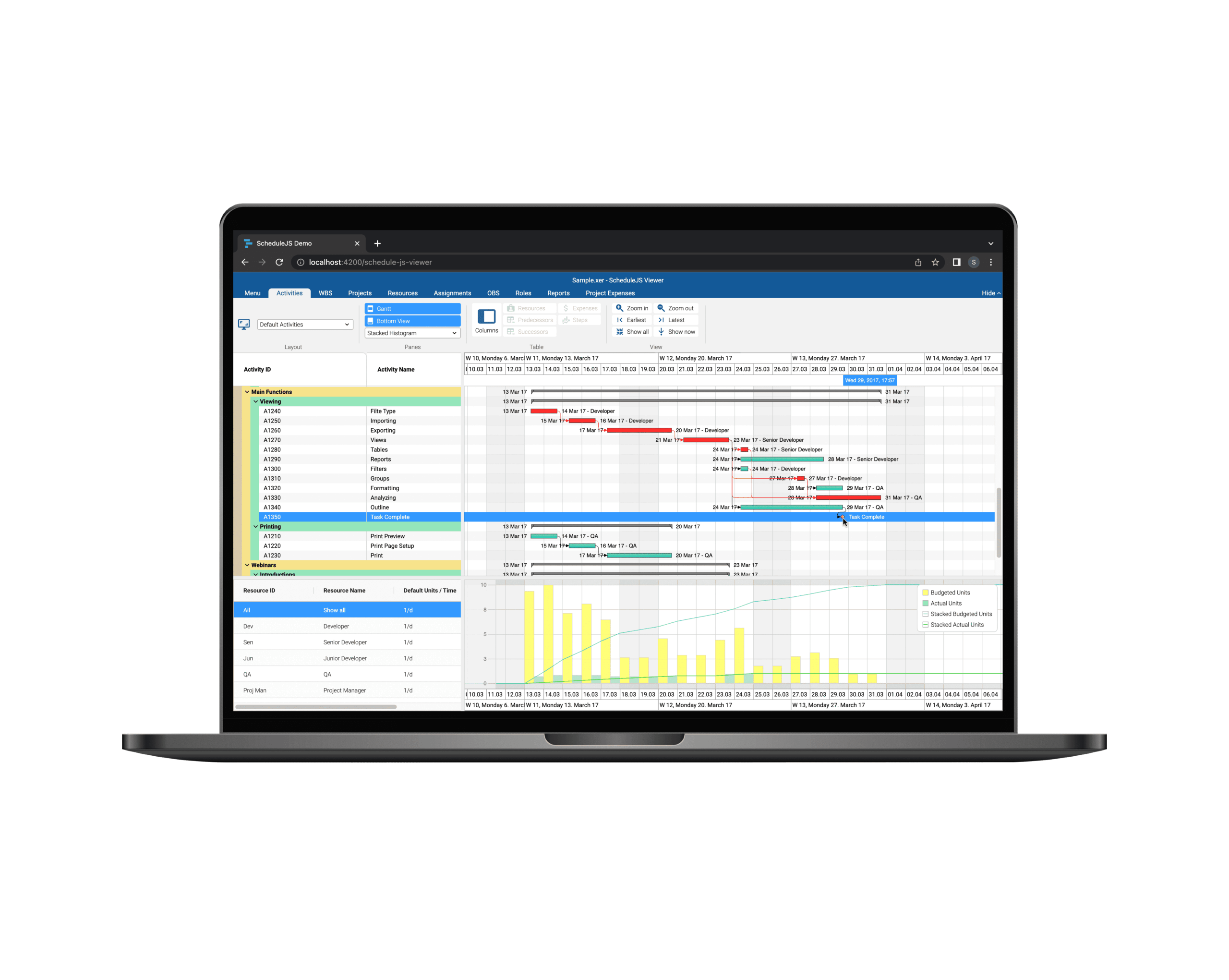
How to handle application events in ScheduleJS. Manage user inputs while performing ScheduleJS actions, design the perfect UX for your app.


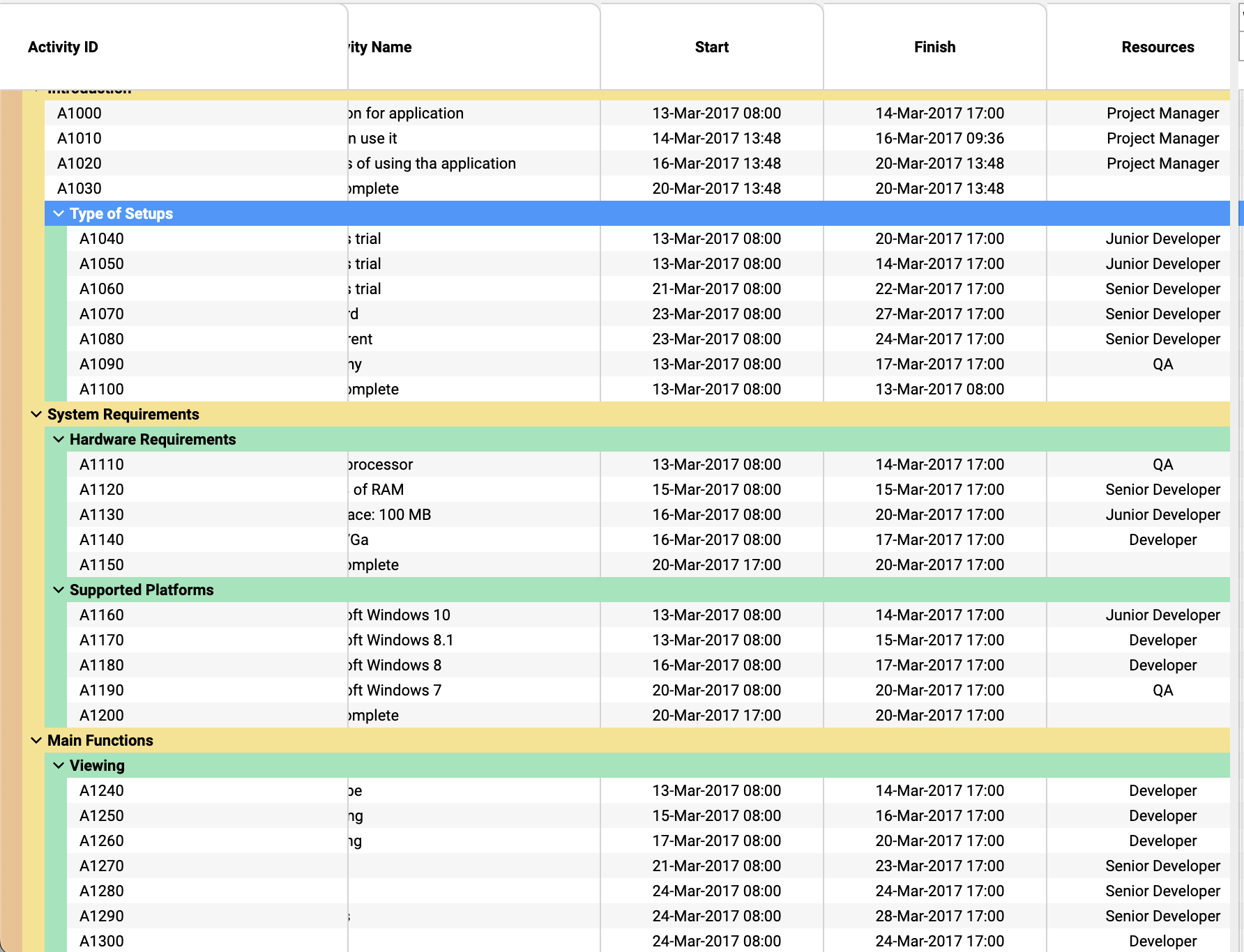
Tree tables can be extensively customised in ScheduleJS: colorful row headers, multiple child levels, display, and interactions
Build custom tree tables in ScheduleJS using schedule-info-column-header-cell and schedule-info-column-row-cell components.

Unlock flexible row management in ScheduleJS: control individual row heights, mix GanttLayout and ChartLayout in the same view.
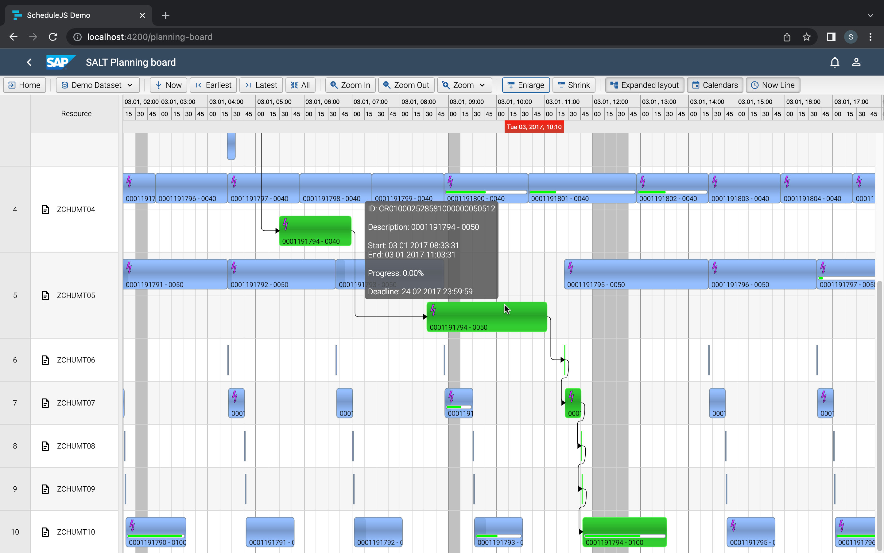
Master drag and drop in ScheduleJS: render activities while dragging, access the drag canvas via DragViewTransversalSystemLayers.
ScheduleJS 1.4 release notes. A step forward towards modern Angular app building.

Angular 16 vs Angular 18 comparison: discover what's new in Angular, the arrival of signals, Zoneless mode, zone coalescing, and their impact on your projects.

Discover the Angular Rome Conference: workshops, domain-driven design, signals, state management, micro frontends.

Discover Angular 18: zoneless mode, zone coalescing, native await, and TypeScript 5.4 compatibility.
Le TOP 3 des diagrammes de Gantt JavaScript. Découvrez leurs caractéristiques, avantages et inconvénients pour choisir le meilleur outil pour votre projet.
