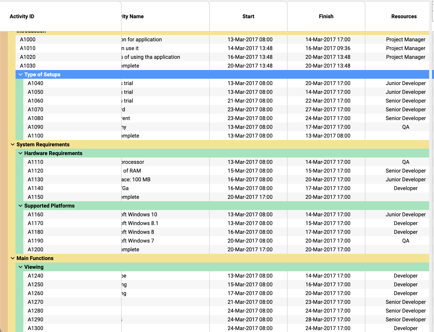
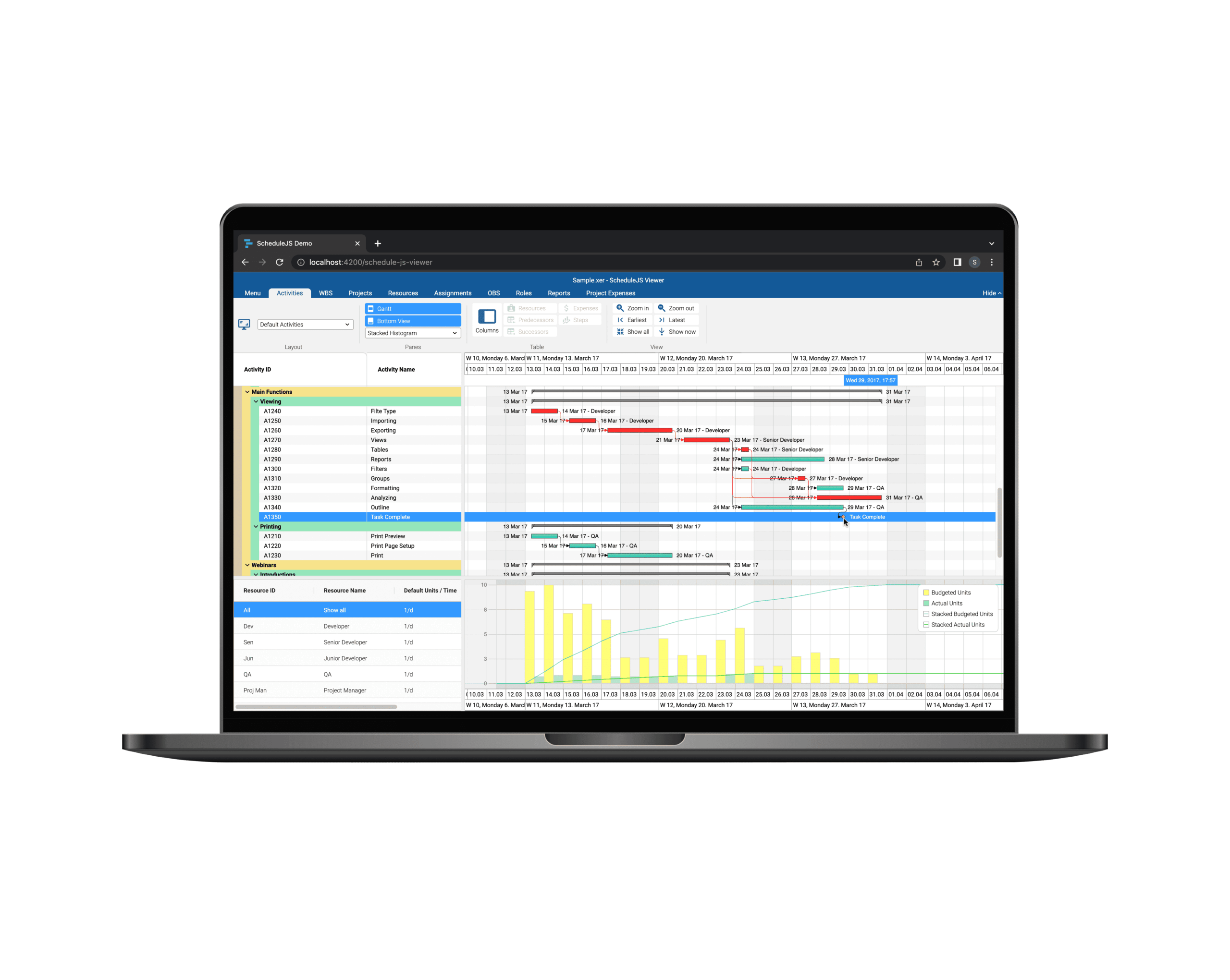
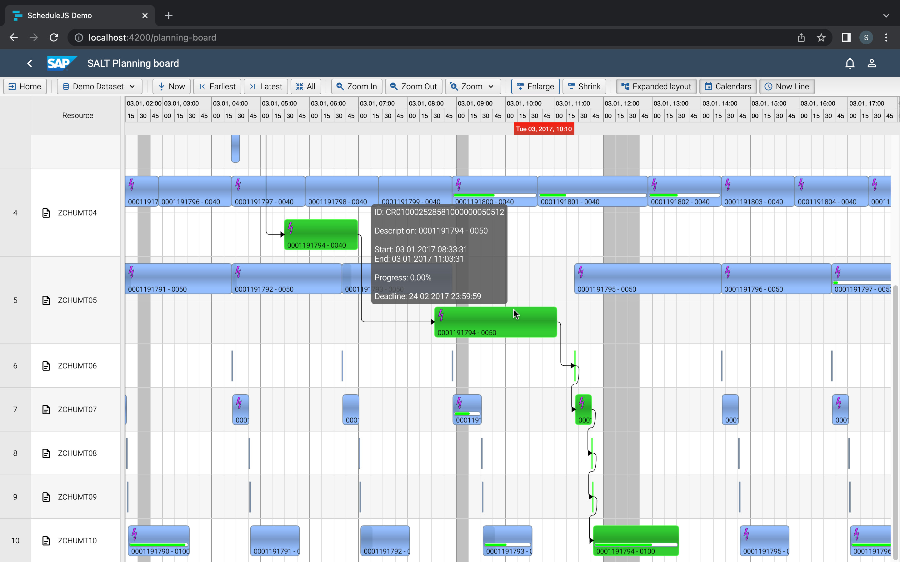
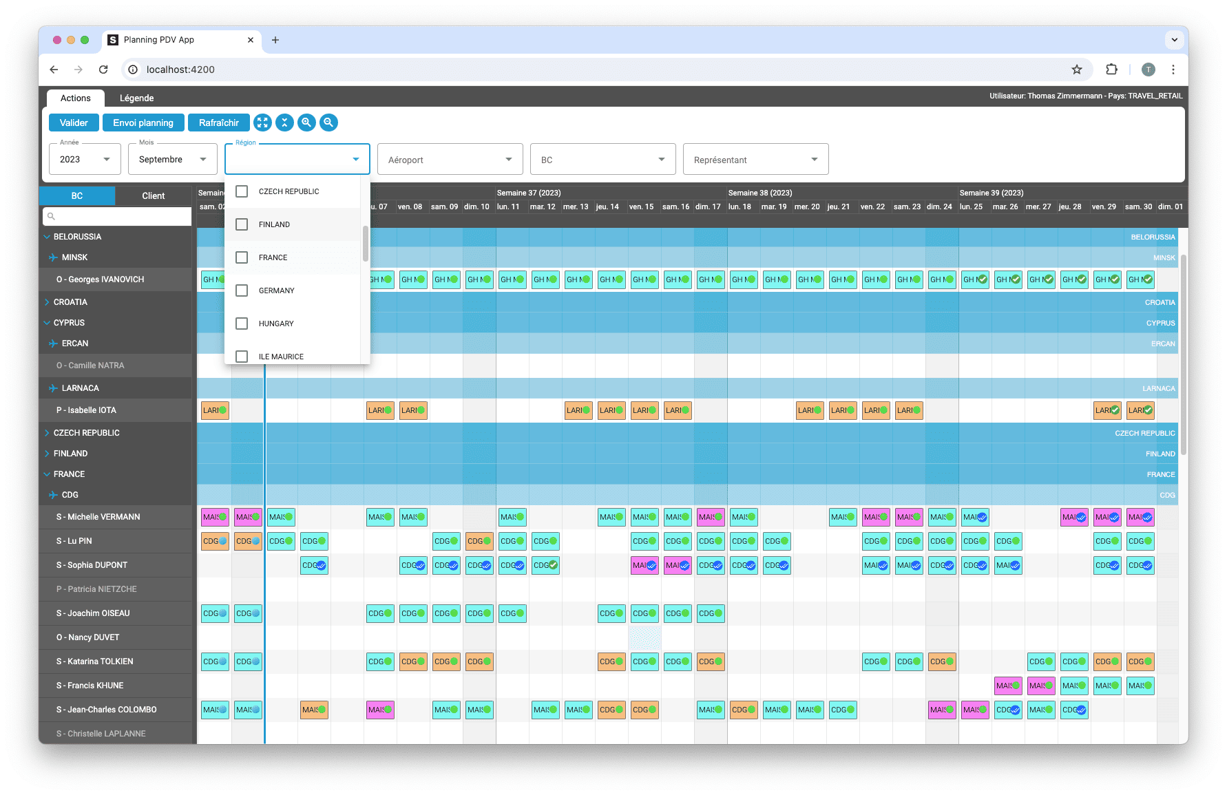
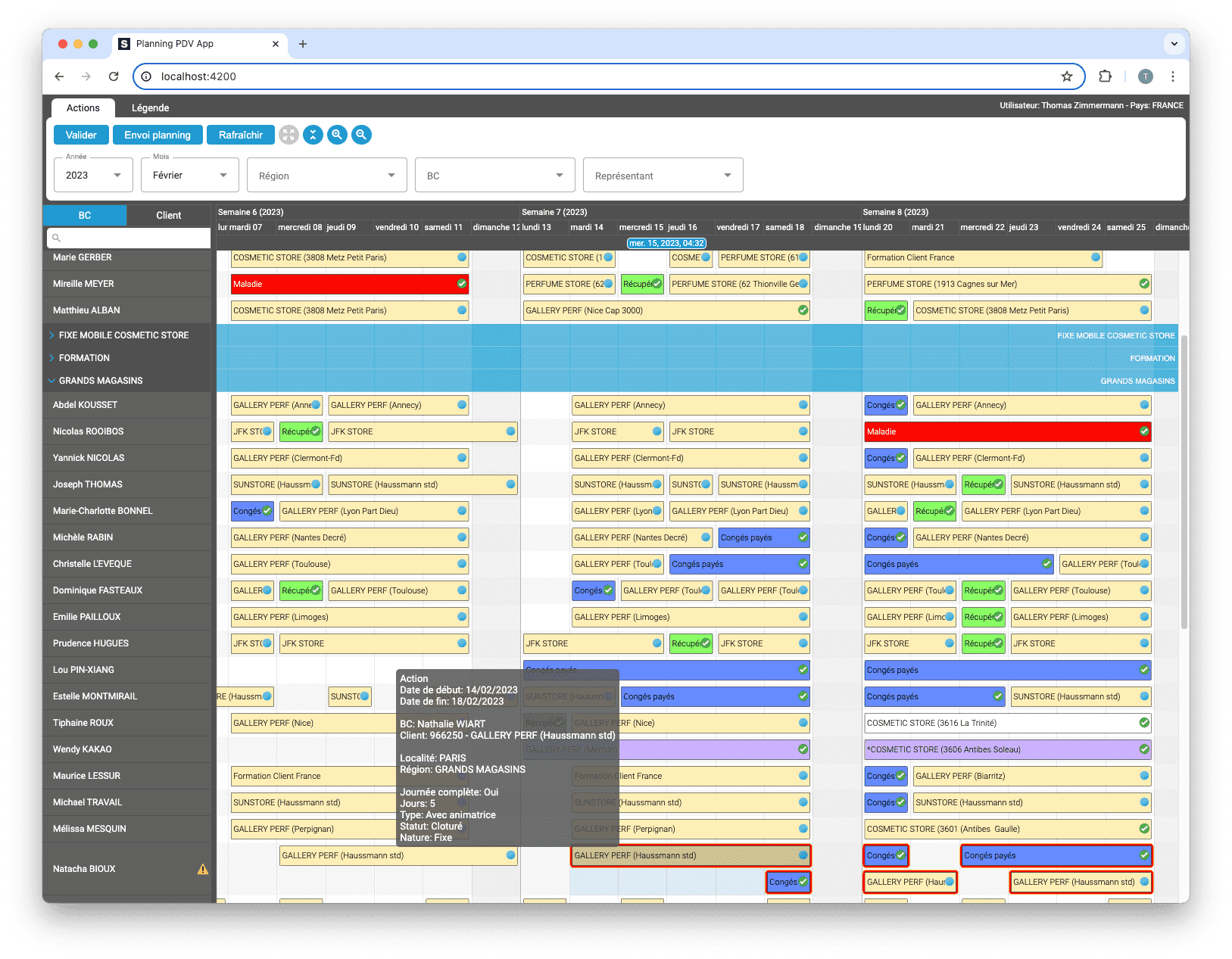
Tree tables can be extensively customised in ScheduleJS: colorful row headers, multiple child levels, display, and interactions
Using a custom info-column
December 21st, 2022 - 4 minutes read
What is the info-column?
Most of the time, what we call the info column is the left-most part of the screen where you find row-by-row information. Some graphics just don’t need an info column, while most of them do. The standard way of building an info column in ScheduleJS is done in two steps:
- First, place the framework component
<schedule-info-column-header-cell>in the timeline block to display every inner-column legend. - Then define a typical row inside the
<ng-template>component of the Gantt graphics using the framework component<schedule-info-column-row-cell>.
When using these framework components you will be granted a set of features out of the box to resize and interact with the info column. But sometimes, you might prefer to build a more specific component or use one of the many Angular components that you can find on the market in place. This article describes how to integrate any Angular component as your custom info column.
The ScheduleJS component
Every application implementing ScheduleJS graphics has to build its ScheduleJS component. Most of the time, this component will be the entry point of the graphics and the info column.
Let’s take a look at this ScheduleJS component template:
If we go through this template, we will find a single container holding three items:
- The Info-column
<demo-analytics-cumulative-graph-info-column> - The Gantt graphics
<default-schedule-gantt-graphic-tree> - The timeline
<schedule-date-line>
Here, the info column is a custom component made with Angular that does not belong to ScheduleJS.
What’s interesting to notice is how the developer can build any view playing with modular components.
The info column block
The following code will display an info column block positioned in its parent container using CSS:
This info column block is composed of two components:
- The info column component using AG Grid.
- A resize-handle, to let the user resize the info column/graphics horizontally.
The resize handle
We want the info column to be resizable. To do so, ScheduleJS proposes a handy Angular component called the <resize-handle>
The resize handle configuration implemented here is the following:
resizeHandleAbsolutemeans it will useposition: absolutefor itselfresizeHandleDirection="right"means it will stand at the right of our component[resizeHandleLinkedSize]and[resizeHandleLinkedSizeChange]are the double Angular bindings allowing it to handle the initial and evolutive width.
The info column component
The info-column component will hold the HTML template and typescript controller for this specific info column. In this example, we want to implement a component from the AG Grid Angular framework, let’s take a look at the template of our <demo-analytics-cumulative-graph-info-column>
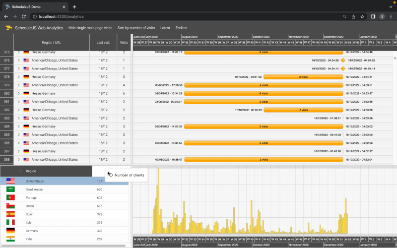
Final result
Here we have an AG Grid component embedded in the ScheduleJS component in a modular way. You can also notice how positioning the <schedule-date-line> after the Gantt graphics component in the template puts it under the graph. Also, we decided that these graphics would not include the <schedule-event-line>, and by simply removing it from the template we can see the graphics and timeline components adapted.

More implementation-related articles
Build custom tree tables in ScheduleJS using schedule-info-column-header-cell and schedule-info-column-row-cell components.
Unlock flexible row management in ScheduleJS: control individual row heights, mix GanttLayout and ChartLayout in the same view.
Master drag and drop in ScheduleJS: render activities while dragging, access the drag canvas via DragViewTransversalSystemLayers.
ScheduleJS 1.4 release notes. A step forward towards modern Angular app building.
Angular 16 vs Angular 18 comparison: discover what's new in Angular, the arrival of signals, Zoneless mode, zone coalescing, and their impact on your projects.
Discover the Angular Rome Conference: workshops, domain-driven design, signals, state management, micro frontends.
Discover Angular 18: zoneless mode, zone coalescing, native await, and TypeScript 5.4 compatibility.
The TOP 3 JavaScript Gantt chart. Discover their features, advantages, and disadvantages to choose the best tool for your project.
Discover how ScheduleJS seamlessly integrated with Selligent CRM, enhancing scheduling efficiency for a leading beauty brand's consultants.

