This article shows how to implement dynamic rendering depending on the current zoom-level of the graphics.
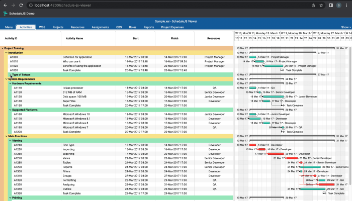
Building a tree Gantt
What is a tree Gantt, how to implement it in ScheduleJS?
November 24th, 2022 - 3 minutes read
What is a tree Gantt?
The tree Gantt is a component where every row is considered either a tree or a leaf. Tree rows have branches linking to other rows that can be trees or leaves. The leaf row is always the most granular and has no further link.
As a developer, working with tree Gantts can be a tedious task, as most of the algorithms use recursion to visit all the vertices.

Implementing a tree Gantt
To implement a Gantt component in ScheduleJS, the first requirement is to extend the right GanttComponentBase. To build a tree Gantt architecture, your Angular component must extend the DefaultScheduleTreeGanttComoponentBase instead of the regular DefaultScheduleGanttComponentBase.
Storing activities in ScheduleJS always involves an ActivityRepository. There are two different types of repositories:
- The IntervalTreeActivityRepository
- The ListActivityRepository
In the case of a tree Gantt, the default ActivityRepository is an IntervalTreeActivityRepository. It allows your application to perform binary search and ensures higher performance when processing a large number of activities.
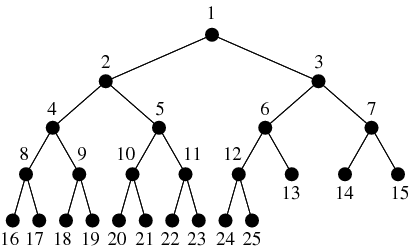
Using a tree Gantt component is very similar to using a regular Gantt component, the only difference is that you have to manually call the gantt.refreshTreeRows() method once you are done with modifying your rows. This is done to avoid redundancy in calling this function as it may lead to lower performance.
The ScheduleJS Viewer activity schedule use case
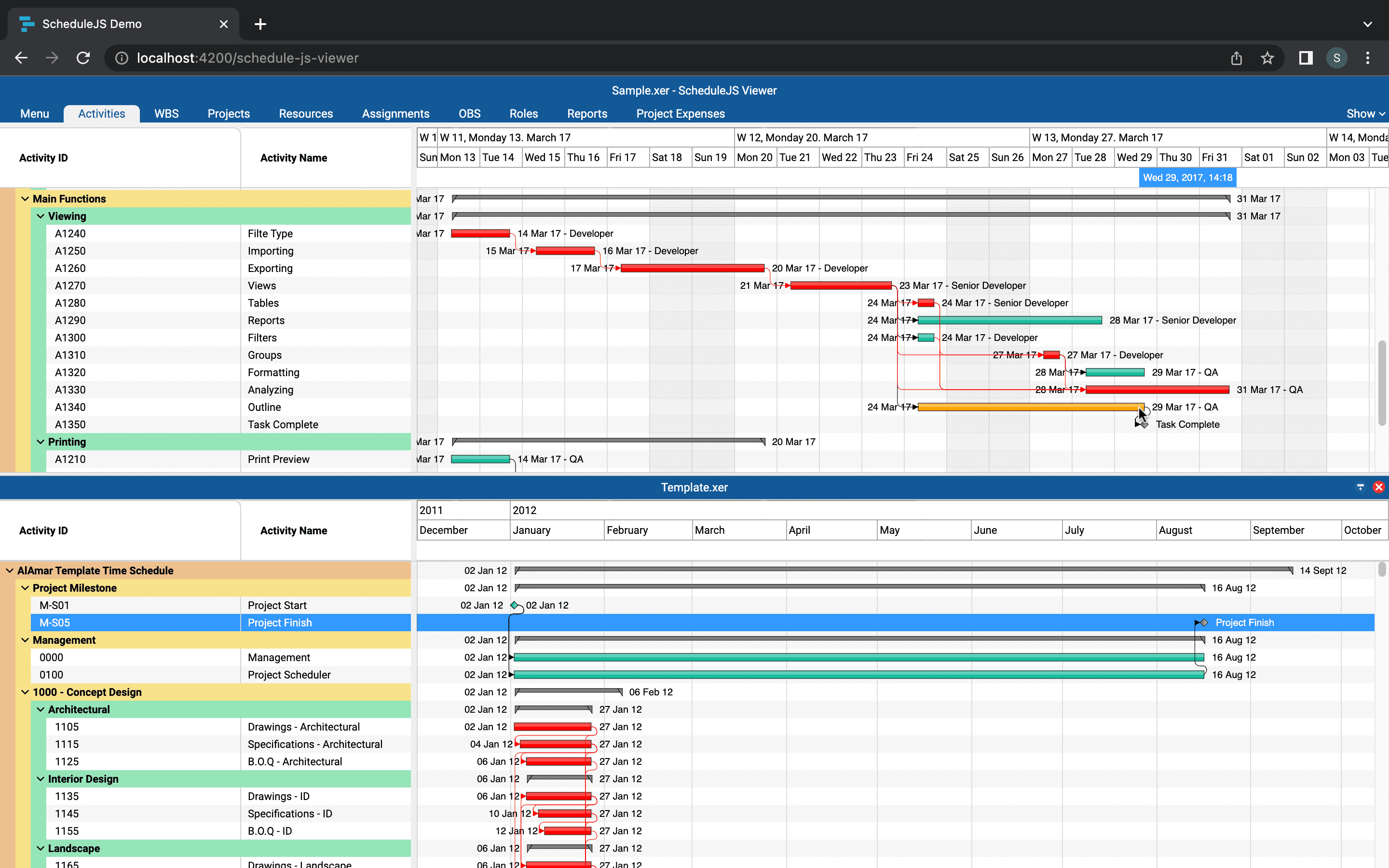
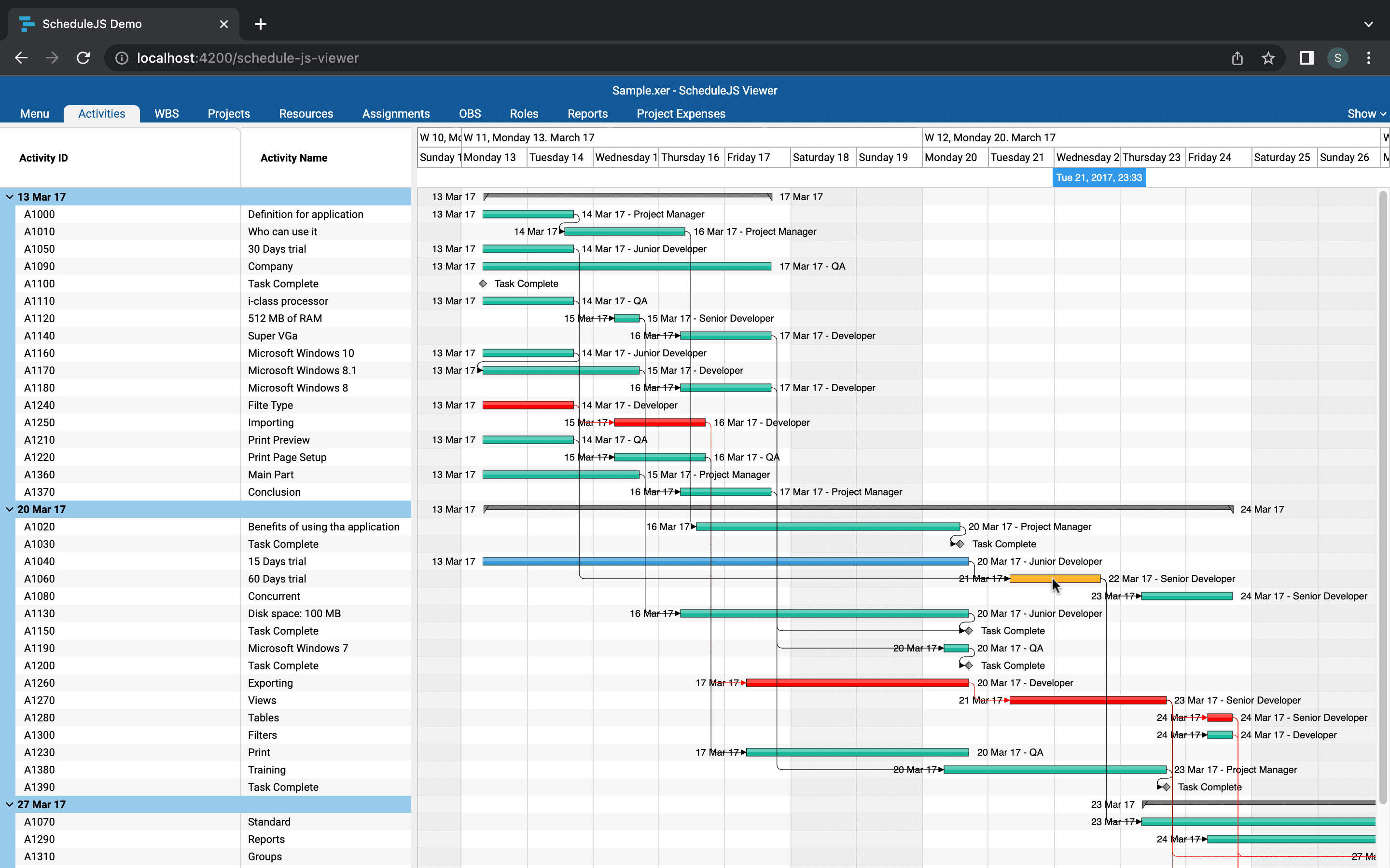
Now we will have a closer look at the HTML file of the ScheduleJS Viewer main component which implements a tree Gantt: the ScheduleJsViewerActivitySchedule. Let’s explain the typical template implemented for the tree Gantt use case.
First, the whole component is wrapped into a <div> to handle display and loading.
Then, all sub-elements will assemble to build the ScheduleJS screen.
The first sub-component is the <schedule-js-viewer-activity-schedule-timeline-block>.
It is responsible for the skyblue, the green, and the yellow squares.
The <default-schedule-gantt-graphic-tree> is a framework component that will handle the display of the tree Gantt and the graphics, in purple.
It accepts a <ng-template> which is handled by the <schedule-js-viewer-activity-schedule-info-colun> component, shown in the red square.
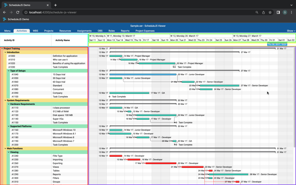
An interesting insight is that every element of the screen can be fully replaced with custom components. For example, users often use custom grids to replace the info column.
The arrows you can see in the info column are used to expand and collapse rows using the defaultScheduleGanttGraphicComponent.onToggleExpand(row) method to set the row as collapsed or open and synchronize the canvas with this information.
The child <ng-template> relative to the <default-schedule-gantt-graphics> expects to receive a component rendering a single line of the info column, and will provide access to the corresponding row data structure using the *using="treeNodeContext.value as row" structural directive.
More ScheduleJS Viewer-related articles
This article will show you how the parent-child tree Gantt architecture within the ScheduleJS Viewer was built.
This article will showcase how the main activity renderer of the ScheduleJS Viewer was built with code examples.
This article presents the main features included in the ScheduleJS Viewer. A brand-new web-based project viewer.


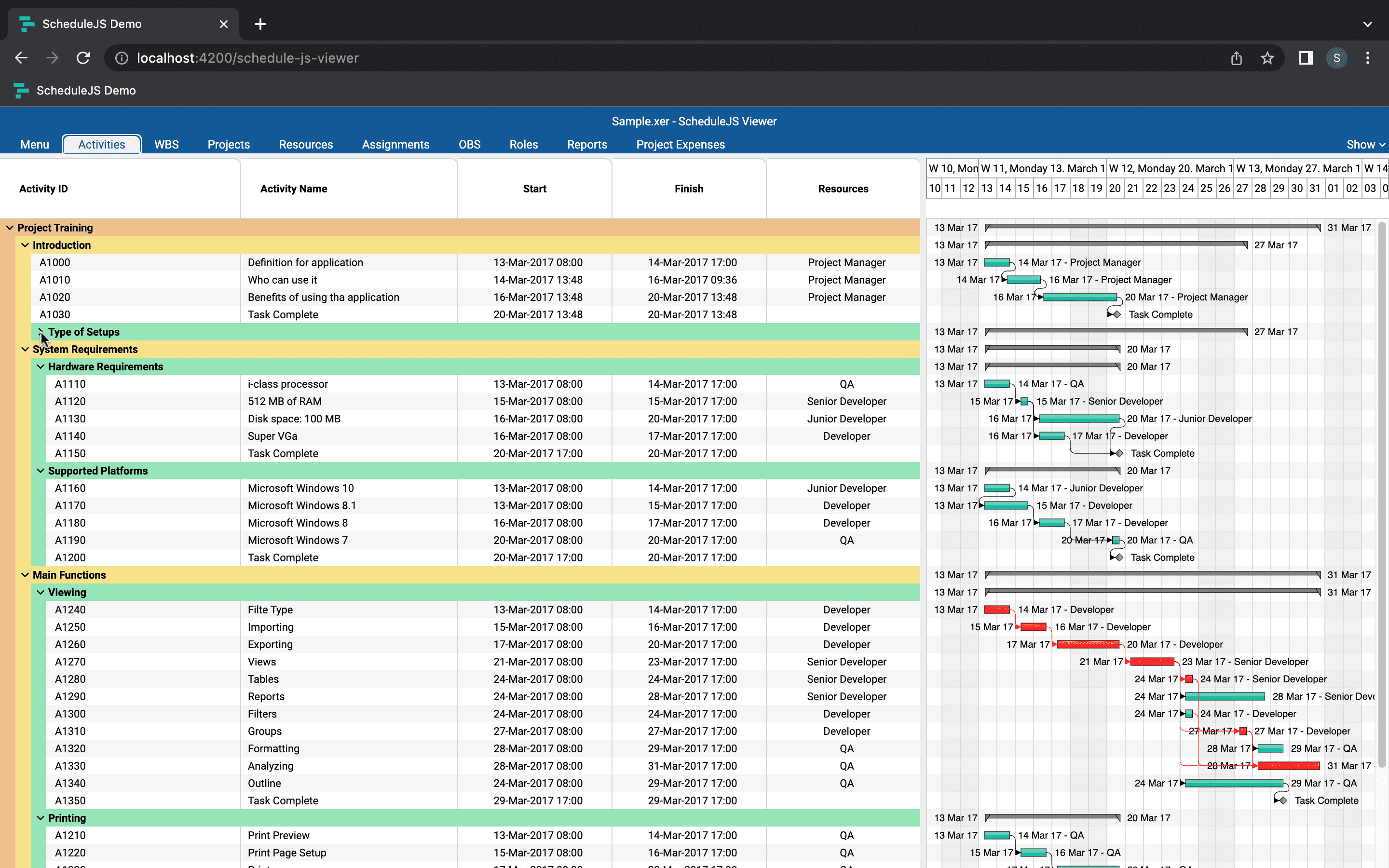

The gantt tree is super interesting to study and code, and can be used in many fields.
I found the explanations on how to use the DefaultScheduleTreeGanttComponentBase and IntervalTreeActivityRepository components very useful. It gave me a good understanding of how to build a tree Gantt in ScheduleJS.