5 - Styling (CSS)
ScheduleJS is rendered through native HTML elements. Each of the rendered items has its own class and can be accessible in a Stylesheet. You can inspect the rendered application using your web browser developer tools and identify the classes you need from here.
Concerning the Angular View encapsulation parameter, Encapsulation.None is recommended. You might have to use the ::ng-deep selector and/or the !important keyword for your style to be applied correctly.
Example styling
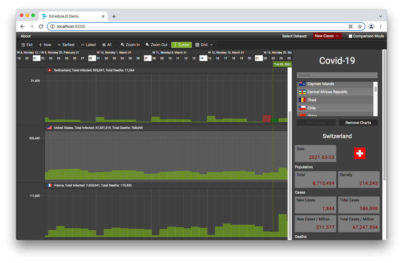
In the following example we are going to override the dateline styles. Let's say we want every day of the week to be displayed on a gray background, with some white text. On the other hand, let's say we want every Sunday of the week to be displayed on a white background, with black text.
You can see the resulting dateline where you can differentiate days using gray background and white text, and Sundays using white background and black text. Below, you will find the associated Stylesheet and Angular Template.
Stylesheet:
// ...
.demo-covid-tracker-date-line {      // Class applied to the <schedule-date-line> Angular Component.

  .schedule-date-line-cell {         // Override the ScheduleJS generic 'schedule-date-line-cell' class.
    background: #404040;             // Use gray background.
    color: white;                    // Use white text.
  }

  .sunday {                          // Override the 'sunday' ScheduleJS 'schedule-date-line-cell' helper class.
    background: white;               // Use white background.
    color: black;                    // Use black text.
  }

  .schedule-date-line-cell:after {   // Override the ScheduleJS 'schedule-date-line-cell:after' pseudo class.
    box-shadow: none;                // Remove box-shadow.
  }

}
// ...
Angular Template:
<!-- ... -->
<schedule-date-line class="demo-covid-tracker-date-line"
                    [gantt]="gantt">
</schedule-date-line>
<!-- ... -->
ScheduleJS classes
For your convenience, the following table lists the main components, their child elements and their associated style classes.
Reminder: A CSS variable named --info-column-width exists to dynamically get the width of the Info Column (left row) directly in your Stylesheet. You can use it to set the width of the Info Column Headers or for a Filler component to complete the space located on the left-hand side of the Timeline.
→ ex: width: var(--info-column-width);
| Component | Depth | Nearest Parent | Element | CSS Class |
|---|---|---|---|---|
| Dateline | 0 | Angular Component | Date Line Row | schedule-date-line-row |
| 1 | Date Line Row | Date Line Cell | schedule-date-line-cell | |
| 1 | Date Line Row | Top Cell Helper Class | top | |
| 1 | Date Line Row | Bottom Cell Helper Class | bottom | |
| 1 | Date Line Row | Month Cell Helper Class | january / februay / march / april / may / june / july / august / september / october / november / december | |
| 1 | Date Line Row | Weekday Cell Helper Class | monday / tuesday / wednesday / thursday / friday / saturday / sunday | |
| Eventline | 0 | Angular Component | Event Line Row | schedule-event-line-row |
| 1 | Event Line Row | Interval Start | schedule-event-line-start-span | |
| 1 | Event Line Row | Interval End | schedule-event-line-end-span | |
| 1 | Event Line Row | Line Cursor | schedule-event-line-cursor-span | |
| GanttChart | 0 | Angular Component | Gantt Graphic | schedule-gantt-graphic |
| 1 | Gantt Graphic | Below View Transversal Canvas Container | schedule-gantt-graphic-below-view-transversal-canvas-container | |
| 2 | Below View Transversal Canvas Container | Below View Transversal Canvas | schedule-gantt-graphic-below-view-transversal-canvas | |
| 1 | Gantt Graphic | Gantt Rows Container | schedule-gantt-rows-container | |
| 2 | Gantt Rows Container | Gantt Rows Viewport | schedule-gantt-rows-viewport | |
| 3 | Gantt Rows Viewport | Viewport Whole Container | viewport-whole-container | |
| 4 | Viewport Whole Container | Viewport Container | viewport-container | |
| 5 | Viewport Container | Viewport Margin Top | viewport-margin-top-filler | |
| 5 | Viewport Container | Viewport | viewport | |
| 6 | Viewport | Viewport Rows | viewport-rows-container | |
| 7 | Viewport Rows | Row | schedule-gantt-row | |
| 8 | Row | Info Row | schedule-gantt-row-info-container | |
| 9 | Info Row | Info Template | schedule-gantt-row-info-template-container | |
| 10 | Info Template | Info Row Index | schedule-gantt-row-info-index-box | |
| 10 | Info Template | Info Row Name | schedule-gantt-row-info-text-box | |
| 10 | Info Template | Resize Handle Container | schedule-gantt-row-info-resize-handle | |
| 11 | Resize Handle Container | Resize Handle | resize-handle-content | |
| 8 | Row | Row Canvas | schedule-gantt-row-canvas | |
| 6 | Viewport | Below Rows Transversal Content Container | viewport-rows-transversal-below-content-container | |
| 7 | Below Rows Transversal Content Container | Below Rows Transversal Canvas Container | schedule-gantt-graphic-below-rows-transversal-canvas-container | |
| 8 | Below Rows Transversal Canvas Container | Below Rows Transversal Canvas | schedule-gantt-graphic-below-rows-transversal-canvas | |
| 6 | Viewport | Above Rows Transversal Content Container | viewport-rows-transversal-above-content-container | |
| 7 | Above Rows Transversal Content Container | Above Rows Transversal Canvas Container | schedule-gantt-graphic-above-rows-transversal-canvas-container | |
| 8 | Above Rows Transversal Canvas Container | Above Rows Transversal Canvas | schedule-gantt-graphic-above-rows-transversal-canvas | |
| 5 | Viewport Container | Viewport Margin Bottom | viewport-margin-bottom-filler | |
| 4 | Viewport Whole Container | Viewport Pointer Events None Scroll Glass | viewport-pointer-events-none-scroll-glass | |
| 1 | Gantt Graphic | Above View Transversal Canvas Container | schedule-gantt-graphic-above-view-transversal-canvas-container | |
| 2 | Above View Transversal Canvas Container | Above View Transversal Canvas | schedule-gantt-graphic-above-view-transversal-canvas |

